SAMPLE RESULTS SAMPLE RESULTS SAMPLE RESULTS
| Potassium Level (PPM) | |||||
| Highest Density of Vegetation | Medium Density of Vegetation | Medium Less Density of Vegtation | Lowest Density of Vegetation | Negative Control | |
| Day 1 | 0 | 0 | 0 | 65 | 0 |
| Day 2 | 55 | 0 | 90 | 0 | 0 |
| Day 3 | 100 | 90 | 90 | 80 | 75.2 |
| Day 4 | 100 | 100 | 110 | 110 | 110 |
| Day 5 | 90 | 90 | 110 | 90 | 120 |
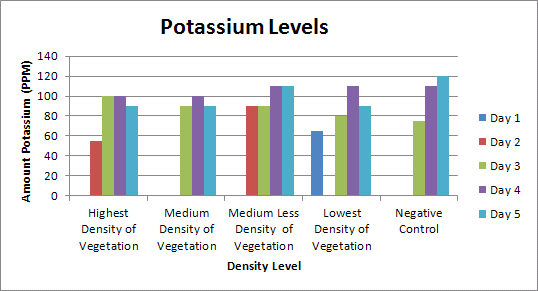
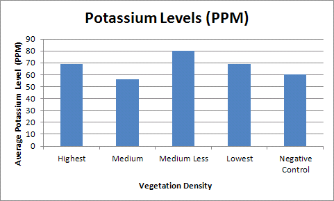
This graph depicts the potassium levels in a more visual manner,but contains the same data as the chart above. While the graph above shows all the data, you should also make sure to make a graph of all the averages, as shown below.
  |
While the graph above shows all the data, you should also make sure to make a graph of all the averages, as shown below.
This is an example of our central tendency chart. After you have collected all of your data, in order to analyze, you should find the central tendencies, as shown below.
| Central Tendencies | |
| ӯ | 66.9 |
| mode | 0 |
| median | 90 |
| s | 44 |
| s2 | 1936 |
| max | 120 |
| min | 0 |
| range | 120 |
| n | 25 |
| s/√n |
8.8 |
This chart shows the T-testing we performed among all the different densities.
T-Testing
Densities
P Value
Highest+Medium
0.68
Highest+Medium Less
0.71
Highest+Least
1
Highest+Negative
0.8
Medium+Medium Less
0.46
Medium+Least
0.68
Meduim+ Negative
0.9
Medium Less+Least
0.7
Meduium Less+Negative
0.57
Least+Negative
0.8
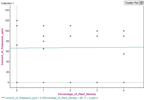
Fathom graphs are a great way to view patterns in data, and see if your hypothesis was correct.
