Sample Results
| The following are
examples of graphs and charts of data from our research.The first three
figures show all the data from all the days in a scatter plot. These
graphs are meant to show the significance of the distance from the tree.
|
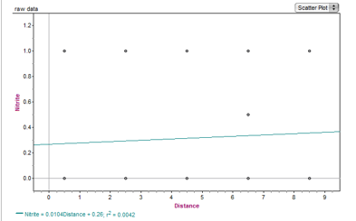 Figure 1: Nitrite Graph |
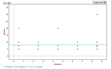 Figure 2: Nitrate Graph |
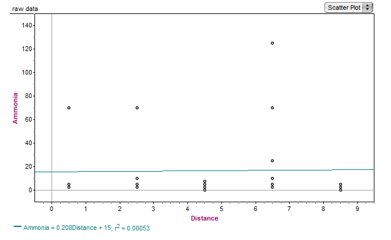 Figure 3: Ammonia Graph |
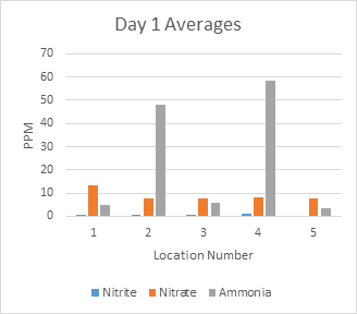
The graph on the left shows an example of a comparison of the averages of the levels of nitrogen. The chart on the right shows the P-values of the different kinds of nitrogen from one location to another. The P-values are used to determine if there is a significant difference in the levels of nitrogen between each distance from the tree. They were found by performing a T-test. If you would like to know how to complete a T-test, here's how: http://www.excel-easy.com/examples/t-test.html |
 |
P-Value Table
Day 1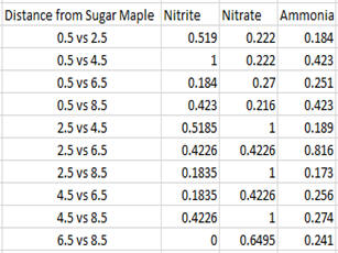 |
|
Figure 4: Day 1 Bar Graph- This is an example of a graph of PPM averages. |
Figure 5: Day 1 P-value example chart |