| Home | Introduction | Procedure | Troubleshooting | Contact Us | Bibliography | Acknowledgments |
| Sample Results |
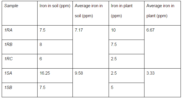
| Data Table |
| We set up our data table by putting the sample number (see labeling system) in the first column, and then list the the data in the following column, and then list the averages for each day in the last column.This continues with the rest of the samples. |
|
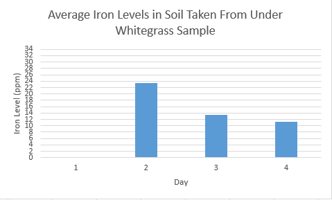
| Graphs |
| The soil graph can be organized using the day # on the x-axis and the average iron level on that day on the y-axis. Generating a graph to illustrate a series of days allows you to be able to observe the possible pattern between the fluctuations of iron levels between the plant and soil samples. The scale and maximum numbers should all be the same so that comparison will be easy. We found that it is easier to have the maximum be an even number when using our scale (which was 2). Using a scale of 2 helped us accurately read the number on the graph. This should be repeated with all the other soil samples taken from other species of plants. |
 |
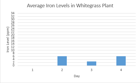
| The plant graphs should be set up the same as the soil graphs for easy comparison. The scales and maximum numbers should be the same as well. |
 |
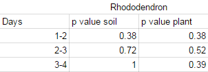
| t-Testing |
| We t-tested the average iron levels on different days for each species. The days we are comparing are on the left column, and the p-values for the iron levels in the soil and the plants are in the right columns. This was repeated for all of the species of plants. |
 |