We used multiple methods to display our data. First, we used tables to display the collected data. Next, we put our findings into separate Fathom graphs, and then we put the data into bar graphs. Lastly, we made T-testing tables.
Serial Dilutions for Bacteria-
This is an example of how we organized our bacteria data. We made sure that columns were included to show the location we were measuring the bacteria levels of, the first dilution that we noticed 5 or more bacteria, the amount of bacteria in that dilution, and the calculated value. To get this calculated value we used the following formula:
colony count number X 102 X 10|dilution|
|
Location |
Dilution |
Colony Count |
Calculated Value |
|
1a |
10-1 |
32 |
32,000 |
|
1b |
10-2 |
5 |
50,000 |
|
1c |
10-2 |
24 |
240,000 |
Protozoa Data-
This is an example of how we organized the protozoa data. We made columns to illustrate the site number, the amount of soil after sifting, the total amount of water added (during Uhlig extracting and soil saturation), the field of view (refer to description below on how to calculate), the average of the protozoa across the fields, and the number of protozoa per soil gram.
To find the number of protozoa per soil gram:
[(# per filed of view at 40X) · (total ml water used) · 747] ⁄ (grams of sifted soil) = # of protozoa per gram of soil
To count the fields of view:
Make sure when you are counting the amount of protozoa, that you are looking at the five different fields of view. These include all 4 corners and the middle of the slide.
|
Site |
Grams of soil |
Amount of water added |
Fields of View |
Avg/ field |
#/ gram of soil |
||||
| 1 | 2 | 3 | 4 | 5 | |||||
|
1a |
9.1 |
50 |
58 |
11 |
77 |
40 |
140 |
65 |
266,785 |
|
1b |
9.8 |
50 |
44 |
55 |
65 |
57 |
104 |
65 |
247,729 |
|
1c |
9.4 |
50 |
72 |
74 |
45 |
68 |
43 |
60 |
238,404 |
Fathom Graphs-
You will need these 3 graphs to display your data. You will need 6 in total, one for your positive control samples and another for the samples after adding water.
| Graph 1 You will need a graph that shows the correlation between any pre-existing moisture levels in the soil and the density of the bacteria. |
 |
|
Graph 2 The next graph you will need is one to display the correlation between the bacteria and protozoa populations. |
 |
|
Graph 3 You will need a graph that shows the correlation between any preexisting moisture levels in the soil and the density of the protozoa. |
 |
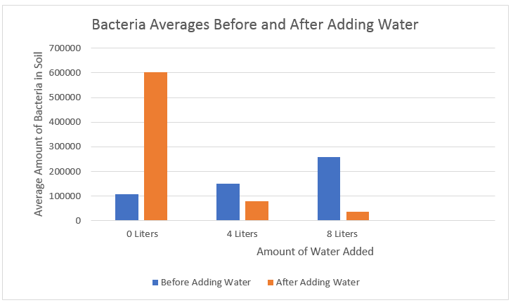
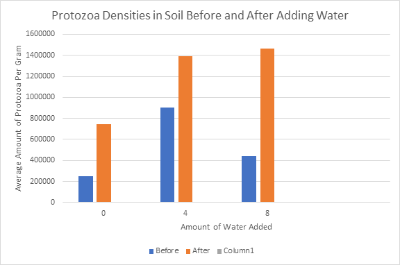
Bar Graphs
You will need these two graphs to display the averages before and after adding water. One will be for the amount of protozoa and the other the amount of bacteria.
| Bacteria- This graph shows the averages of the calculated values in each plot, before and after adding water. |
|
| Protozoa- This graph shows the average amount of protozoa per gram among each plot, before and after adding water. |
 |
T- Testing
You will also need to have separate data tables made to display your calculated P-values.
|
You will need to have a total of four data tables. - Table displaying the bacteria T-testing data, before adding water -Table displaying the protozoa T-testing data, after adding water -Table displaying the bacteria T-testing data, after adding water -Table displaying the protozoa T-testing data, after adding water All of the tables should have the following format:
|