Sample Results
![]()
![]()
![]()
![]()
![]()
![]()
![]()
|
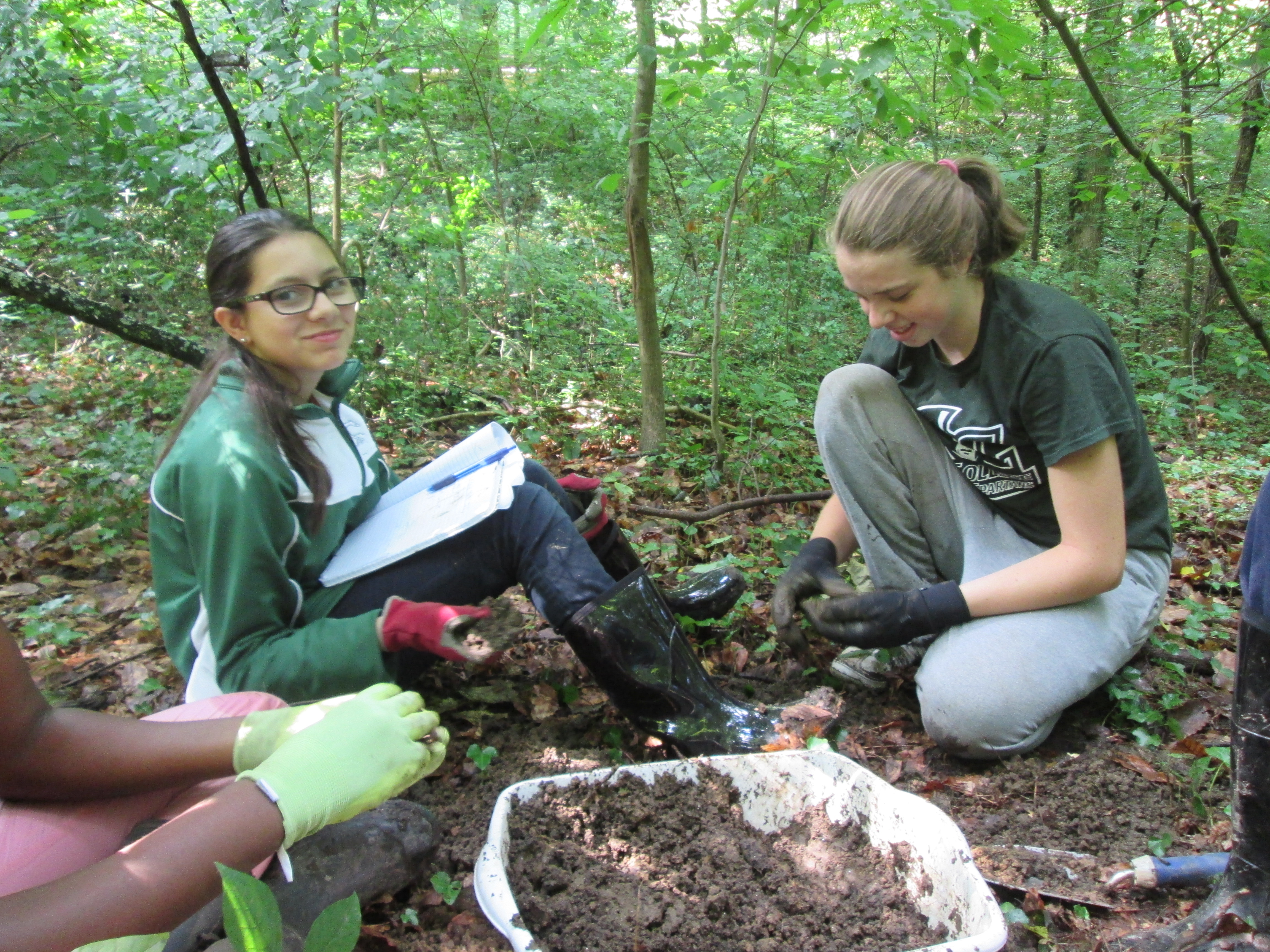
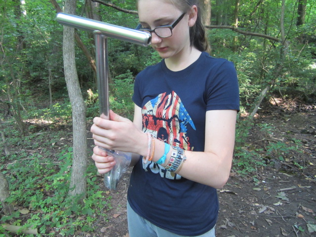
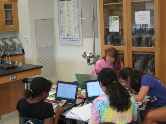
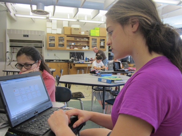
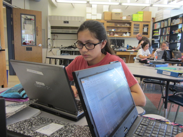
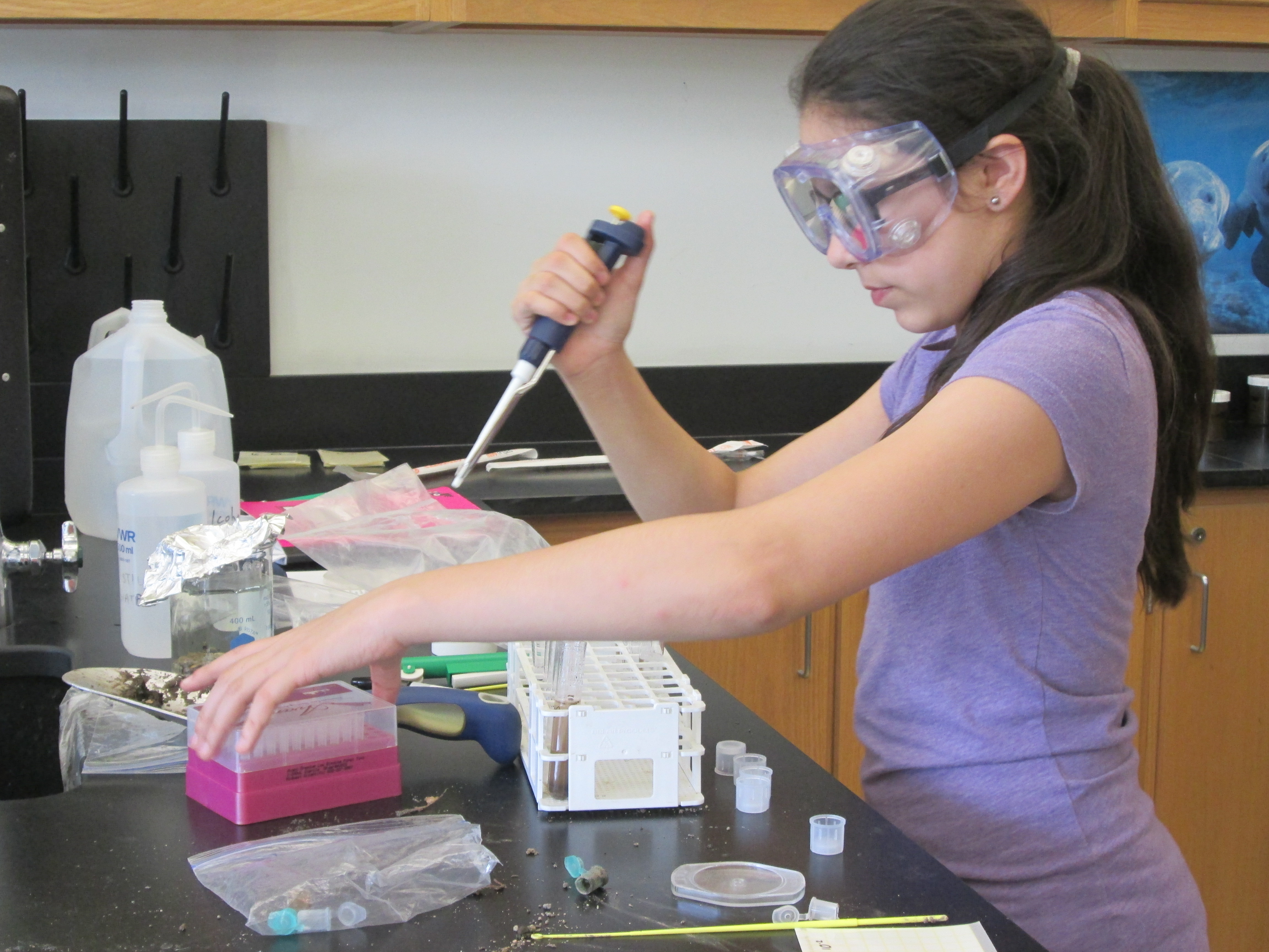
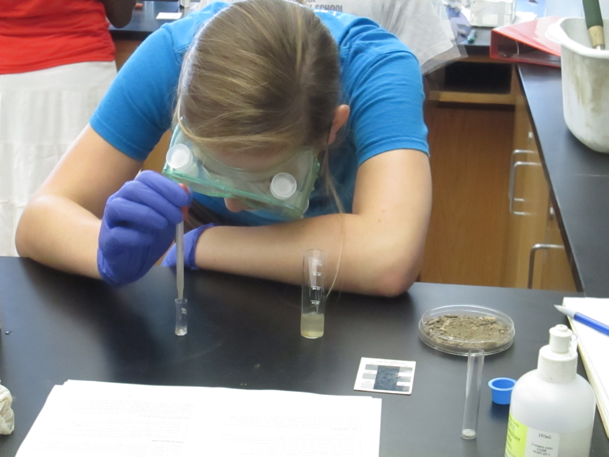
To start an experiment the first step is to ask a question, create a hypothesis, design an experiment that tests your question, collect your data and finally analyze it and come up with a conclusion. To collect data from an experiment similar to ours, plot a site where you will take soil samples and record these locations, we took 10 samples per day. Then collect these soil samples and label them with their location. Using these samples test for Ferric iron, mold and bacteria levels and make a data chart. |
|||||||||||||||||||||||||||||||||||||||||||||||||||||||||||||||||||||||||||||||||||||||||||
|
|
|||||||||||||||||||||||||||||||||||||||||||||||||||||||||||||||||||||||||||||||||||||||||||
|
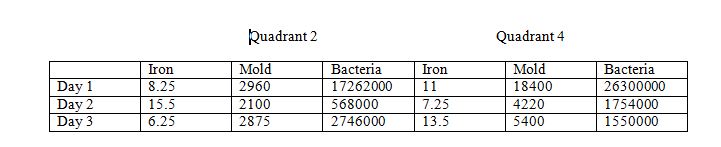
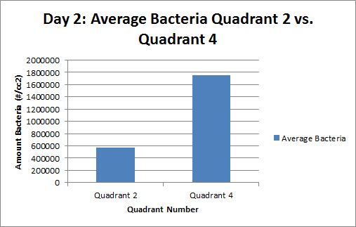
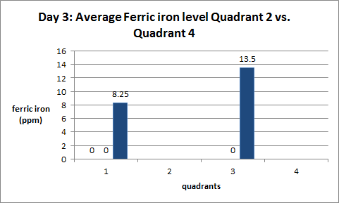
After collecting your data you should organize and analyze your results. To analyze our data we calculated the averages of the bacteria, mold and iron levels from both quadrants each day. Averages are important because they provide a simplified list of the data for easy analysis.
|
|||||||||||||||||||||||||||||||||||||||||||||||||||||||||||||||||||||||||||||||||||||||||||
|
We also ran t-tests on each data list to calculate their statistical significance. (For further explanation of a t-test click here) T-tests are important because they help evaluate the statistical significance of the data.
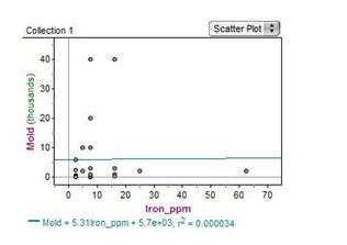
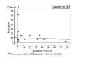
Another thing you can do to statistically analyze your data is to make a scatter plot, run a line-of-best-fit and calculate the r2 value. This will tell you the strength of the correlation of the two variables you are comparing. This test can be done on a TI-84 Plus calculator (for further instructions click here)
To
keep your data and stats organized is to create a data table and graphs. Graphs
and charts give you a visual representation of your data and can help
make it easier to analyze. Here are examples of our data tables, graph and charts.
|
|||||||||||||||||||||||||||||||||||||||||||||||||||||||||||||||||||||||||||||||||||||||||||